Project 1- Concept Art Final Piece
Wednesday, 16 November 2016
Friday, 9 September 2016
Friday, 20 May 2016
Exhibition Plan
People who showcase video games will usually put them on display and let people come and play them, this way people can see what they think of the game first hand, to accomplish this they would put it on a site like flash game site like kongregate. If I had the resources and the time I would probably set up the game to play on a console like the ps4 with a widescreen tv. If I could I would invite sega to the exhibition. This is the visual plan for my exhibition:
I will probably invite my Mum but other than that I'm not quite sure who to Invite. I could advertise my exhibition on instagram, pinterest and youtube.
I will probably invite my Mum but other than that I'm not quite sure who to Invite. I could advertise my exhibition on instagram, pinterest and youtube.
Evaluation for Final Major Project
Part 1 of Evaluation
My project theme was a side-scrolling plaform game, like Vectorman or Sonic the Hedgehog on the sega megadrive. My idea was developed from my previous 2d platform game project, I decided to develop the idea because in my previous project I only managed to finish my character and two platforms and I figured I could do alot more with the game in the fmp than I did in the 2D platform game project. I used alot of different reference images from art sites and games also went out to take pictures of the cathedral in Lichfield for observational drawing, I also got some walk cycles and flying cycles to help with my animation. The various different images I got off art sites helped me with my artist interpretations and my level design, it also helped me develop the animations for Ronex, I also was able to come up with the dash attack for the boss in the first level. All the research I did on animation made my animations alot more fluid and life like, also the research I did on anatomy helped me with the proportions of all my sprites. My research into construct has really helped to understand the program, my skills on construct have improved immensely since last project and also I feel that my drawing skills have improved slightly during this project, but in my opinion I think my photoshop painting is the thing that has Improved the most during this project. The art from American Mcgee'a Alice has been an inspiration for the art style of my game, alongside comic books and manga such as Spiderman, Eyesheild 21 and Pokemon. American Mcgee most likely uses photoshop and a drawing tablet, comic artist's would use copic markers and ink, manga artist's only use ink from what I know, I have seen a few manga that are in colour but those are few and far between. I mostly used a wacom tablet and photoshop to do all my design work, this is because photoshop helped me to make the sprites and animations quicker and more efficiently with lots of detail, I also used construct to build the game, because instead of having to all the coding yourself it has preset codes which you have to put in different events boxes and these event blocks basically powers your game, so you can do all the design work with little to no coding involved. I used the painting technique I learned from Shiam, to colour a lot of the different characters and platforms in my game, along with a lot of the concept art I did for the game. For construct I followed a tutorial on scirra which is the construct site and from that tutorial my knowledge of construct increased drastically and I figured out how to make the sprite separate from the platform behaviour, I needed to keep it separate because the animation seems to clash with the platform behaviour, so instead of putting it on the sprite I put it on a box and I set the sprite to got to the origin point every tick, so the sprite is bound to the box. I think all these different techniques and materials I used, made my game a lot better and it is now in playable state and I think all in all it now sort of resembles the game I had in mind. When I started the project I was planning two detailed levels with rpg elements and two bosses, as I went through the project realised that wasn't a realistic goal so I decided to do one level because I figured that it would be better to do one detailed level with a boss and enemies than to rushed levels with no bosses or enemies, I also changed who the first boss was because I realised that I had already made full concept art of character that I had already thought the characteristics, so I thought why not use him as the first boss. I probably should have done more researched into construct because I probably could have got a lot more of the game done if I did and also wished I had researched more into animation so I could have learnt to animate the background properly because my current animated background is legitimately hard to look at. The formal element of art I have used in my final piece are tone, shade, colour and shadow. The visual languages used in my game are animation and colour, The animation improves immersion in a game, it generally makes the game feel more alive, Colour is another thing that can add life to your game, people are more drawn to games that have interesting colour schemes and if your game is just full of bland lifeless colours not many people are going to want to play it. I used animation to make my bird enemies fly and I used a colour scheme that mostly consisted of purple and greys. I was trying to show that you were caught in the pull of a tornado, so I made the platforms slightly tilted to make it look like they are spinning round in the tornado. I think I was successful in conveying them, It does look like your scaling a tornado because of all the tilted platforms and the fact they are all bits of debris from houses, roads and parks. I'm happy with my final piece but I'm kinda sad that I didn't manage to do all that wanted to do, maybe if I started it sooner I could have done a bit more, but I'm still happy at how it turned out. My favourite part of my final piece has to be the enemies, I'm very proud about how they turned out because out of everything they work exactly how they are supposed to and I think the animation I did for them looks half way decent. I think I followed my proposal quite well, I just didn't have the time to finish it because I was very unrealistic at the beginning of the project. Since the start of the project I have consistently updated my blog and shown the progression of my project. I would wanted more time to finish because I wanted to put a few more enemies in the game.
Part 2 of Evaluation
I learned a new photoshop painting technique and how to use construct. I put all had learned from the previous projects and this project, to make my fmp final piece the best it could be, I used the painting technique I learned for the sprites, I learned how to efficiently use frames to create smooth animations and I learned alot about how to make a platform game on construct and through this I managed to make a decent game. The thing I did the best was definately the animation. Alot of the mistakes I made were in the event sheet in construct, things got glitched or just didn't work, so I needed to go back to the event sheet and fix it. If I could do something differently I would have spent a bit more time on my game and tweaked it a bit more. The sessions when we were learning about how to draw were the most helpful to me. We learnt a bunch of new ways to practise drawing hands from Shiam. I could use the techniques from all the drawing sessions to improve my own skills. One of my enemies wasn't working the way I wanted it to, but I eventually figured out that I needed to set the action variable to right, also I needed to make a scalable rope and the first tutorial I found didn't work, so I did a little and I finally found a tutorial that worked perfectly.
Methodology of my software experiments
Painting on Photoshop
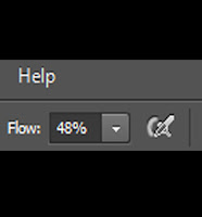
Step 1: Set the flow of your brush tool to 50 or below, this will make it so your brush doesn't blob out colour and will enable you to paint in all the fine details.
Step 2: Choose your base colours, I'm using an image from google to save time.
Step 3:Start drawing an outline with the base colours you have chosen.
Step 4:Next Block out the colours and mix them and make sure you adjust the opacity as your painting.
Step 5: After you have blended all the colours together it should look almost like an oil painting, it may not look that good at first but if you keep practising you can make some amazing paintings with this technique.
Bibliography
Bibliography
http://www.cinemablend.com/television/Teen-Titans-Moving-Forward-Get-Details-68841.html (2015). (Accessed: 27th February 2016)
http://www.gamesindustry.biz/articles/2014-05-01-american-mcgee-xbox-one-will-fail-in-china (2014).
(Accessed: 27th February 2016)
http://www.italian-renaissance-art.com/images/arm-and-shoulder-leonardo.jpg (n.d.).
(Accessed: 27th February 2016)
http://www.imdb.com/name/nm0613460/ (n.d.). (Accessed: 27th February 2016)
http://www.moma.org/learn/moma_learning/vincent-van-gogh-the-starry-night-1889 (n.d.). (Accessed: 27th
February 2016)
L1qzlzwqo1_500.gif (n.d.). (30th March 2016)
http://megaman.wikia.com/wiki/Yellow_Devil (n.d.). (22nd April 2016)
obalt_blue_knight-d2y1i8s.jpg
(n.d.). (Accessed: 30th March 2016)
http://www.public-republic.de/artist-of-the-week-mariana-trifonova.php (2009). (Accessed: 27th
February 2016)
http://www.pcgamer.com/reinstall-american-mcgees-alice/ (2011). (Accessed: 27th February
2016)
https://www.pinterest.com/Boobearsmama10/alice-madness-returns/ (n.d). (Accessed 27th
February 2016)
https://uk.pinterest.com/pin/162974080235768032/ (2012). (Accessed: 27th February
2016)
https://www.scirra.com/tutorials/591/a-simple-method-for-climbing-ladders-in-platformers (2013). (9th March 2016)
https://www.scirra.com/tutorials/253/how-to-make-a-platform-game/page-1 (2012). (9th March 2016)
https://translate.google.co.uk/translate?hl=en&sl=cs&u=http://www.filabrasileiroclub.cz/mimochod.htm&prev=search (n.d.). (Accessed: 6th
February 2016)
http://tunza.mobi/articles/wildlife-superhighways/ (2014). (Accessed: 30th
March 2016)
Kingdom Hearts 1(2002)Square Enix.[PlayStation 2 and
Playstation 3]. Japan: Square Enix
Shantae and the Pirate's Curse(2014)WayFoward Technologies.[Nintendo
3ds, Wii U, PlayStation 4, Xbox One,
Microsoft Windows and FireTV.North America: WayFoward Technologies
space-whale.16141/page-17 (n.d.). (16th March 2016)
Vectorman(1995)BlueSky Software.[Sega
MegaDrive].North America: Sega
www.shutterstock.com/s/male+anatomy/search.html(n.d.). (Accessed: 24th
February 2016)
www.shutterstock.com/s/bird+in+flight/search.html (n.d.). (Accessed: 6th February
2016) (n.d.). (Accessed: 6th February 2016)
This is my Bibliography of virtually everyone of my references, this includes images and games I've mentioned.
Friday, 29 April 2016
Friday, 22 April 2016
Ronex Level 1 Enemies
Birmageddon's
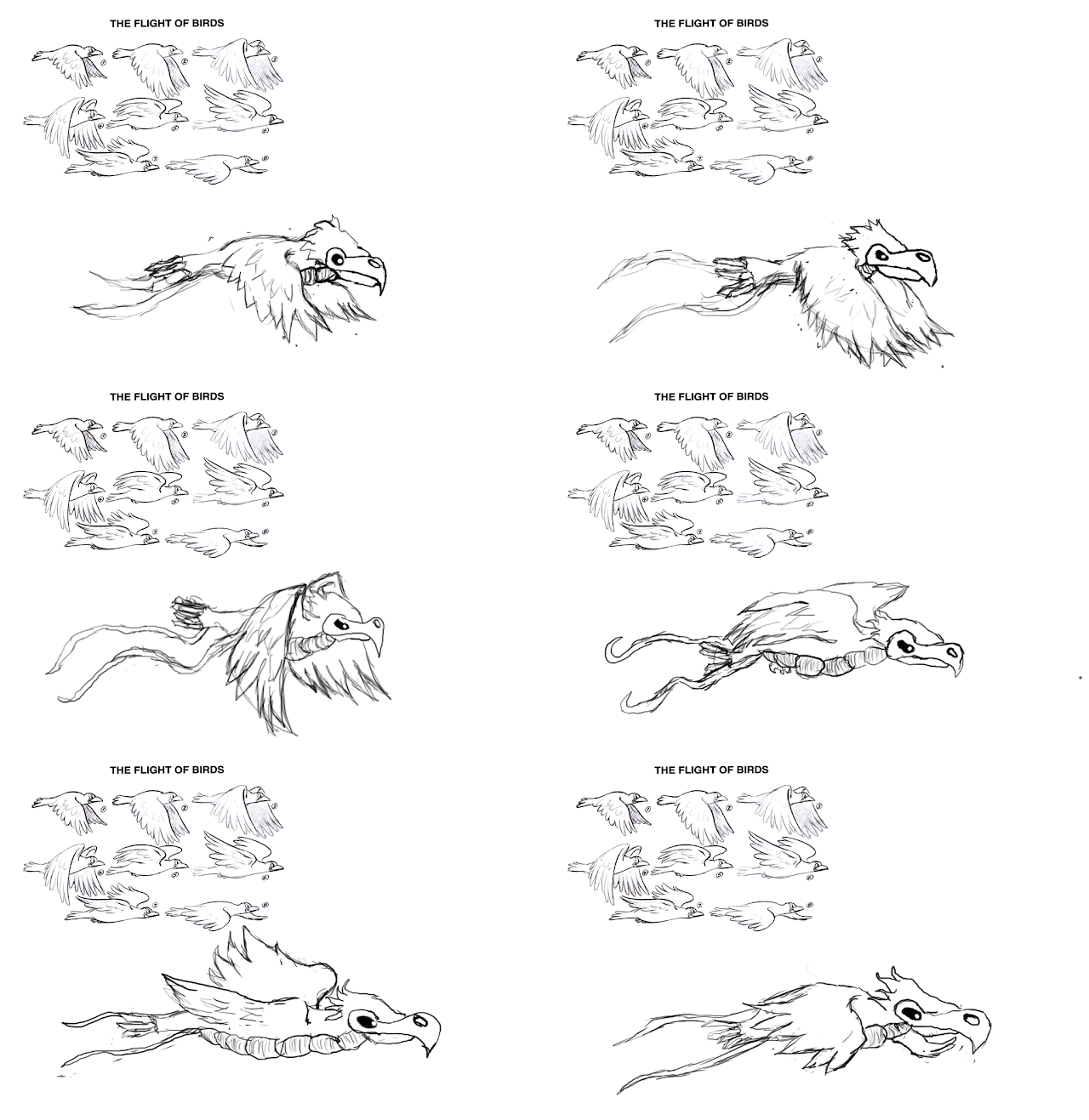
This is a Birmageddon I'm using a reference image from google to be able to know a bird's flight pattern, this will also help me with the anatomy of a bird.
Animation Steps
I will show the different frames I used in this animation below.
Frame 1
Frame 2
Frame 3
Frame 4
Frame 5
Frame 6
Frame 7
Frame 8
Corrected Animation
I made each of the frames of an equal size so it didn't look like it was growing as it flies.
Ronex Level One Boss Fight: Dexter
This is the first boss for Ronex his name's Dexter and he's an angel, in this first battle he's only using a quarter of his full power. The reason he's holding back is because he's supposed to be testing you.

The first sprite is an idle sprite and the second one is an attack Sprite.

The first sprite is an idle sprite and the second one is an attack Sprite.
Dexter being a celestial being can move at super sonic speeds, he will use this speed to get from one side of the field to the other, you need to jump over him while moves to the other side otherwise he will do alot of damage, it's sort of like the yellow devil fight from Megaman.
This is the Yellow devil fight from Megaman 1, it's my inspiration for Dexter's light speed dash attack.
In this picture you can see the sprite sheet is starting to come together, he's starting to distort.
I updated the sprite sheet again with another frame, this time he's preparing to dash forward.
The next sprite his him about to charge at you.
This is the finished sprite sheet, I made the fill slightly more transparent with the last two sprites because I think it gives a good idea of how fast he is.
This is his completed light speed attack animation, I used the liquid tool to make the different smudge effects and I used the layer settings for the distortion effect.
I improved the animation giving him an entrance and exit, While he was going out I lowered the opacity and I raise the opacity as he's coming in.
At the moment I'm colouring in his idle sprite and one of his other attack sprites.
My Wish List for Ronex
If I have enough time I will make a Second Level and Include the boss I was planning.
I would like to add some sort of story to the game.
Tuesday, 19 April 2016
Ronex Construct2 Progress
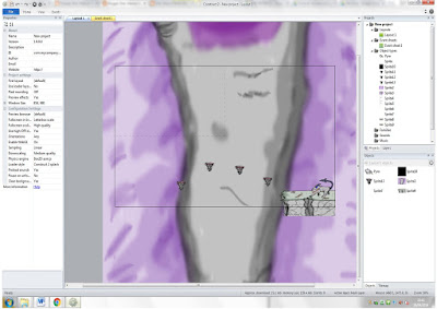
This is my game so far, I have a few platforms and my character is able to move about the level.
I figured out how to make my level bigger, it's the column layout size in the left hand margin I set it to 1709 to 1900, I also made the platforming a bit more difficult. I need to work on the background and make it easier on the eyes
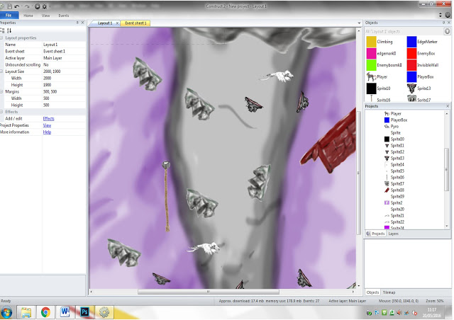
I have added a scalable rope, a couple of enemies that move from side to side, a few more platforms and I also restructured the level so it actually feels like your scaling a tornado. To make the enemies move from side to side I made a box put it over the enemy sprite and added the platform behaviour, then I made an instant variable they are triggers to activate an event, in this case making the enemy move left to right.
I have updated the background and added in the sprite for the boss battle.
Tuesday, 12 April 2016
Final Major Project: Problems and Choices
The Problems I Have Run Into
The first problem I ran into was in my concept art and trying to figure out how to draw a hand, Shiam helped me to get the the hand in the right position.
I had trouble with the artist interpretation of American Mcgee's work, I tried to do it on paper but it didn't really work out, so I did on photoshop and after I learned one of the painting techniques for photoshop, I think it turned out really well. I have used this painting techniques in all my photoshop paintings.
My animated Idle sprite was messing up the platforming, so I updated the sprite slightly and made it static.
I found a ladder and rope tutorial I tried, to replicate it but it just wasn't working, so I found another tutorial.
I had a problem with one of the enemies I inserted into the game, it wasn't going back and forth like the other sprite.
Choices I Have Made
I was initially going to do all the levels in Ronex, but I was informed that it would take more than 14 weeks to complete
the game I had in mind, so I settled on doing 2 levels and only
doing more if I had the time.
I have decided to use Dexter as the boss of the first level instead of the character Nix, because I already have a solid character design for Dexter.
I will only make one level of the game because I would rather make a detailed and in-depth level than a two rushed and very bad levels.
I made the platforms bigger so that it would look more like the character is actually jumping on a solid platform.
I found from a tutorial on the construct site scirra, that if you put the platform behaviour on a separate box instead of the actual sprite, the animation actually work properly and it doesn't conflict with the platform behaviour.
Monday, 11 April 2016
Reference Images from Lichfield Cathedral

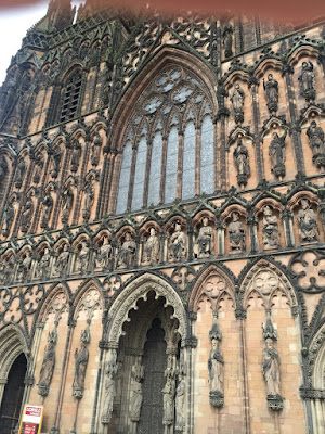
These are pictures I took of the Lichfield cathedral, I will use assets from these pictures to form the structure and design of my level.
Observational Drawing
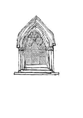
In this observational drawing I just drew the window, this is because Shiam said that doing the whole cathedral would take too much time. This will help me with the design of the second level I'm planning, because during the level your climbing up a cathedral and this could work as a platform, to be able to scale up the cathedral.
Friday, 8 April 2016
Drawing Practice: During Easter Holidays

This is a werewolf hand, to make this I drew my own hand in this position and drew extra features on to it.
Wednesday, 30 March 2016
Animal Anatomy Research
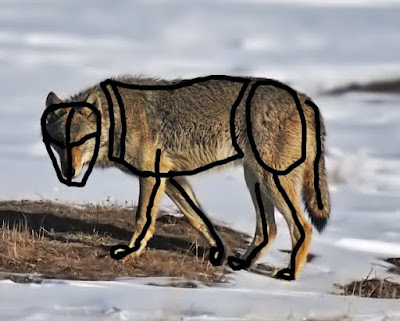
This is me trying to figure out the anatomy of a wolf, I took
a picture of a wolf from google and outlined the joints.
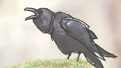
I'm trying to figure out the different sections of a Raven, so when I come to making the boss battle I know which parts to move when making it's animations.
What I need to make my 2d game good
Character Movements
This is a sprite sheet it's used for the animations of the characters, these are used for 2 dimensional games.
Dynamic Background
This is a background from the first sonic game, it's background is animated by using multiple frames, to
create the illusion of movement.
Interesting Boss Battles
To make an effective boss battle, I should make them tougher than the average enemy obviously, put down different things you have to destroy or collect before you can
hit the boss, have a different soundtrack, vary your bosses attacks as they weaken.
I also think that it's interesting to have a different way to defeat a boss, like beating them in a race, a good example of this is Sonic CD.
Wednesday, 23 March 2016
Photoshop practice 2
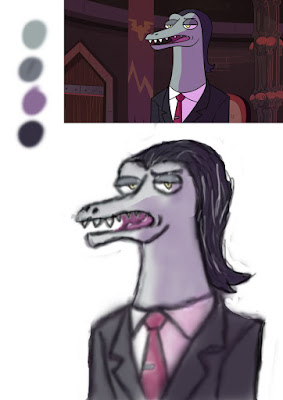
This is a painting I did of a character from the series star vs the forces of evil, this helped me work on my shading.
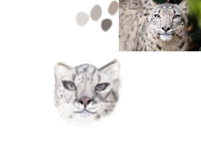
This is a painting of a snow leopard, this helped me with my detailing and tone.
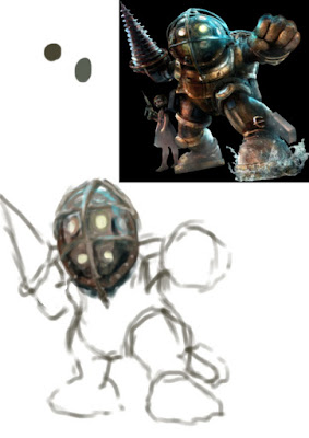
This is the Big daddy from Bioshock I used him to work on my texturing and to revise on how to paint on photoshop after the holiday.

This is a painting of a snow leopard, this helped me with my detailing and tone.

This is the Big daddy from Bioshock I used him to work on my texturing and to revise on how to paint on photoshop after the holiday.
Tuesday, 22 March 2016
Feedback on blog

This is some feedback I got on my work, the suggestion I got was add some mini-bosses to my game. I got positive feedback on my Blog design and structure.
Friday, 18 March 2016
Level Layouts and Design
Level 1:
This level is a city level, but it's been twisted up by Billy in his tornado form, To get to the end of this level all you need to do is
get up to the top with out falling off. To navigate through this level
you follow the arrangement of the platforms. The theme of this level is a suburb.
These are the different platforms found in level 1.
Level 2:
In this level you have to run into time clock to slowdown time, so
you can get past the lasers that will kill you in one shot. all while avoiding the bosses projectiles. The places you see the little circles on the ground ( the stopwatches ), that's how you know where you
need to go. The theme of this level is a cathedral.
Subscribe to:
Comments (Atom)


