In this exercise we practised dominant forms, subdominant forms, subordinate forms, leading line and focal points. Dominant forms are usually the biggest and most contrasted objects in a picture, Sub dominant forms are the slightly less big but there can be more than one of them and they usually are the frame of the picture and lead to a central point, the subordinate form is the smallest and normally the the thing you see last in the picture, the leading line point toward the focal point of a picture and finally the focal point of the picture is the point on the picture which everything is pointing towards such and you normally can find a focal point if you follow the leading lines, however some pictures can have more than one focal point .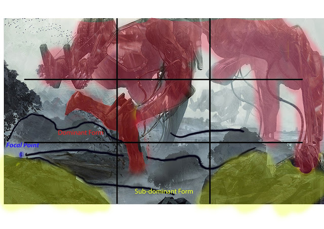

The giant machine is the dominant form, the rocks in the foreground are the sub dominant form, the leading lines are the hills and trees in the background and the rocks in the foreground, they all lead to the man on the left hand side of the picture who is the focal point.
The dominant form is the person with the laser gun on his back, the sub-dominant forms are the arch by the character and the row of lights on the right hand side of the picture, the leading lines go all the way around the cylindrical hallway and the focal point is the blue portal at the end of the hallway.
Rule of Third
The rule of the third is a grid that breaks an image down into nine different parts, this makes it so you can more accurately pin point the perspective of the picture.
Golden Spiral
The Fibonacci sequence is the mathematical term for the golden spiral; This is a grid that spirals round and eventually leads to a focal point. As the spiral starts coming closer and closer together, the objects within the sequence become smaller and smaller until they reach the focal point.
Concept art thumbnail sketches-September 28th 2016
We did some quick sketches for concept art using the rule of third and the golden spiral. Personally I think these sketches are pathetic and I'm not in the least bit proud of them they just both look awful; The anatomy is atrocious, there's no actual environment to speak of and they took way to long to make considering how horribly shoddy they are. However the point of doing these sketches is to learn how to utilise the golden spiral an the rule of third.
Concept art for a city-September 30th 2016
First we were told to build a city with different things we found in the cupboard in the games design room: things like wrenches, speakers, clamps, sewing machines, etc. The artist who influenced this decision was Syd Mead; he is the concept artist for blade runner and his main focus is dynamic cityscapes, I think the city we made needed more thought put into it, because it looked more like a trail of junk than an actual city.
After setting that up we had to take a particular part of the the structure we made and draw the calligraphic lines (calligraphic lines are the outer-lines of the object). We then had to make a concept for a city by using our imagination; this drawing is an analogue picture; I don't like this picture at all I think the perspective is way off and their I could have added more shading then I initially did.
Artist Research-October 4th 2016
The Sublime means to invoke fear and immersion in the person who is viewing the picture, the reason we use this in concept art is to give the viewer an idea of the scale and the vastness of the world you have come up with.
Here are some examples of The Sublime:
Syd Mead
This is an example of the sublime because it has very dark lighting, the fog in the distance gives the idea that the city is enormous and seemingly goes on forever; The fear that's invoked by this picture is the fear that you are just a spec in an incredibly massive city.
The different criteria for the sublime are: Darkness, Obscurity, Vastness and Loudness. The picture has high contrast shadows in a lot of the different parts of the city, fog obscures the back of the city giving you a better idea of the scale, the picture is shown in a birds eye view your overlooking the city and you can see it stretches out for miles and finally the city has all it's lights turned and the fog is actually the smoke coming from the building so therefore it could be conceived that the city is actually very loud; This is why it is an example of the sublime.
Daniel Rupp

There's high contrast shadows all around the temple, the entrance to the temple has been blurred out by fog to give you an idea of how long it is and the bottom is covered in fog so you can't see how far down it goes, you could relate to the guy walking down the pathway from the temple and how insignificant he is compared the to the depth and the magnitude of the cavern, In this vast cavern everything would be amplified sounds like: gunshots, screams and even footsteps would be enhanced. This is why it's an example of the sublime.
Bastien Grivet
This is an example of the sublime because the whole picture is painted with high contrast shadows, the mountains in the background are all fogged out to make the dinosaurs pop out more, the helicopter shooting the missiles is tiny compared to the T-Rex and sort of gives the impression that the missiles are not even piercing through it's hide; One of the T-Rex's has their mouth open and is probably roaring at the helicopter, also the missiles that are being shot at the T-Rex are definitely making a lot of noise; it almost makes you feel if you died out here, no one would hear you scream.
CityScape Concept Art- 5th October 2016
We took the cityscape we made and started to develop it digitally into photoshop, To do this we used the the rule of third, the golden spiral and horizon line; We chose between doing a one point, two point or three point perspective. The golden spiral's mathematical name is the Fibbonachi sequence.
This is what I've done so far...
I think this one is a massive improvement over the sketch, however their are still plenty of things I don't like: the messy lines, the detail on the rocky platform and it's still very bland, but I'll keep going at it and see how it turns; The horizon line of the sketch is further up therefore your looking down on the picture, I used this perspective because I wanted to give a view of all the carnage and chaos that was going on in the picture.
I developed my sketch more and changed he perspective of the tree; I added the other set of windows and put the sign on Drumpf tower, I also added a building behind the tower; The bees are much bigger than they were in the original picture. I think I like this slightly better now, granted it's not brilliant and there are plenty of things I could improve on, but this will work as a base for the painting.
Colour Theory- 11th October 2016

Highly contrasted colours tend to attract more people to a painting, this is because humans find some meaning in colour in a picture; In fact their are some colours that attract more people than others like red, green, black, etc.. using these types of colours in moderation can really boost the amount of people interested in your work.
Colour Wheel

German Expressionism Films- 14th October 2016
German Expressionism an art form that was done in Germany, from the year's of 1910 to 1930; This art came in the form of movies and paintings, they would have very over the top backgrounds and highly contrasted colours, the paintings and films of the time were usually very focused on the frightening and depressing things that were going at the time.
What Ever Happened To Baby Jane (1962)
What Ever Happened To Baby Jane is more Film Noir than German expressionism although it is heavily inspired by it; for example the very dark nature of the movie it doesn't make everything seem wonderful,it very much pushes the point forward that Jane is delusional and everything will not turn out well in the end for her; also the film has very highly contrasted lighting and in some of the scenes the backgrounds can be very surreal.
In Memoriam of Karl Liebknect (1920)
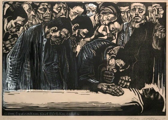
This is definitely an example of German Expressionism: It was made after 1910 and before 1930, it's a painting done in monochrome (one colour in different saturation's), the colours are very highly contrasted and the line are all over the place; the subject matter involves a death of a guy who was killed during the conflict of the first world war and it's shows that this is a very sad piece of art.
Paul Leni: Waxworks (1924)

This is another example of German Expression, the reason for this is because all the entryways and windows are all contorted and surreal instead of just being plain squares or rectangles, also the lighting is all very highly contrasted and monochromatic, the lines in the scene are all twisted and have no order to them. This movie contains several different stories and their all about people being put to death or murder.
Dr Jekyll and Mr Hyde (1931)

This Movie isn't German Expressionism, it's very inspired by it but I think it leans more onto being plain film noir, It does have the high contrast and monochromatic colour, but it doesn't have the weird surreal backgrounds and it's a very tame film it has a happy ending; Dr,Jeklyll is seen as the as the noble hero being taken over by his dark side, which he eventually overcomes in the end; This movie also wasn't made between 1910 and 1930, which is when all the true German Expressionism was being made.
Jakob Stienhardt (1913)
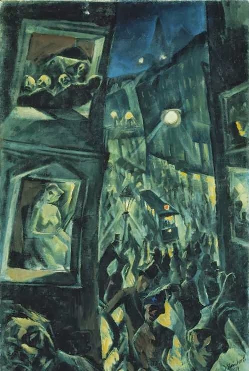
This painting is most definitely German Expressionism, It was made a year before the First World War happened but you can clearly see the city is very militarised and the people in the houses look very frightened. All the ascetic aspects of German Expressionism are there too like the highly contrasted colour, the different types of crazy line and just how overall dark the subject matter is.
A Game Based Off Nosferatu- 19th October 2016
Nosferatu is a Silent German expressionist film made in 1922, it's based off the events of Bram Stokers Dracula (the book version).
Nosferatu is not entirely black and white, in fact a lot of the scenes in the film are actually done in a monochromatic colour scheme, I should really think about this when making a game based of this movie.

Unnamed Game
After the death of Count Orlok in 1854, their have been many vampires that have wanted to claim the title as the ruler of the underworld but none have succeeded. Ruler of the Underworld is not just a title that's exclusive to vampire's the current ruler is a stone golem nicknamed stoner, it's a name to purposely mock him however no one has managed to defeat him yet every vampire that has tried has either come back badly beaten or so mashed that they could be brought back in a coffee cup. Here we come to our "hero" of the story Tome (this character's appearance and gender can be changed) Tome is an office worker, who wants some excitement; while walking down a spooky alleyway our hero comes across an old man
Half Term: German Expressionism Marathon- 22nd October 2016
M (1931)
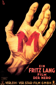
Directed by: Fritz Lang
This is a movie about a murderer who goes around killing different children, however the movie only shows a child named Elsie getting groomed and eventually killed by the murderer. This murder is the last straw for the people and they go on a man hunt for the person that did it, that lasts for the majority of the movie. This movie for me was a lot more enjoyable than Nosferatu, it didn't spend that long on a specific scene. Long enough to clue us in about what's going on, but not so long that it makes you want think why isn't this scene over already . Here are some of the scenes from the movie that represent German Expressionism.


Whatever Happened To Baby Jane (1962)

Directed By Robert Aldrich
Whatever happened to Baby Jane is about a child star called Baby Jane, who is now an adult who's still believes she can revive her career which is long since over. Her sister got disabled in an "accident" is being taken care of by Jane. As the movie goes on Jane slowly gets more and more unhinged and her sister gets more terrified as the movie goes on. I really enjoyed this movie, I like how dark it is and how it never seemed to hold back on these moments, their was none of the usual sentimental dribble that tends to be in a lot of movies; What I mean by that is an overly emotional movie that's only purpose is to emotionally manipulate people into giving their money.These are some of the examples of German Expressionism in the movie.

Vertigo (1958)

Directed By Alfred Hitchcock
Vertigo is about a guy named Scotty who oddly enough has vertigo, he falls in love with this women who the husband thinks is possessed and later on she commits suicide, then Scotty meets another women who looks exactly like his friends wife who is played by the same actress. I found this movie to be very dull not much went on until the half way point and even then I didn't find myself involved in the plot. I watched this movie because Alfred Hitchcock was heavily inspired by German Expressionism while making it, you can clearly see this with some of the shots taken from the film.


Spellbound 1945

Directed By Alfred Hitchcock
Spellbound is about a psychiatrist who's trying to protect a man, who believes he's murdered someone and she spends the majority of the movie trying to prove that he's not guilty, it's a sort of a mystery/romance movie. In my opinion this movie was incredibly dull and uninteresting, the only German expressionist bit in the movie was the dream sequence which was illustrated by Salvador Dali; Here are the bits that are the most expressionistic.
Psycho (1960)
.jpg)
Directed By Alfred Hitchcock
Psycho is about a women who stole some money from this rich guy, so she runs and stops at Bates Motel. Norman Bates greets her and gives her a room, later on Norman ends up killing this women; from that point on the rest of the movie is set around her murder. It's not just a classic it's also a spectacular movie, Norman Bates is a really interesting character to follow and so are Marion Crane and Lila Crane
the one who gets killed and her sister. I feel like this is a massive cut above most of the films I've watched (apart from What ever happened to Baby Jane that movie is just a good as this one). There are quite a few scenes in Psycho that are heavily inspired by German expressionism.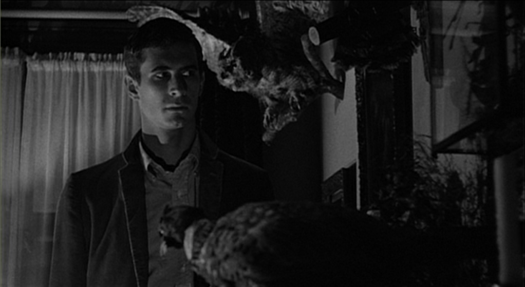

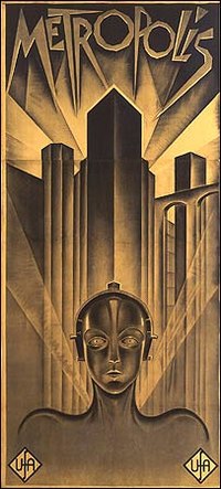
Metropolis (1927)


German Expressionist Piece (Experimental Stage)- 2nd November 2016
Moodboard
German Expressionism Experiments
These are some quick sketches. For these sketches I used the polygonal tool, the fill tool and the transform tool. These are just experiments to give us an idea of what we wanted to do, in our actual final piece.
The yellow is the sub-dominant forms.
I like the design of this one , I think if I work in to it a bit more it could become something really cool. It look like a helmet from a soldier who was killed in battle, I could probably do something around that sort of concept.
To be honest I'm not very impressed with this sketch I think it could have put a little more work into it. I think if I paint it then it will be better, but a really I want to spend time developing the first sketch I did, because that one is much more interesting and impressive.
Concept Art Final Piece- 9th November 2016
This is the sketch I chose for my final piece, I think this sketch is really cool and their are so many things I could do with it.
I decided to paint it in black and white, I was going to paint it in full colour but I found that it was much better looking in a grey-scale format.
Research on Chiarscuro Artist's
Leonardo Da Vinci

The face of the angel is the primary highlight of the painting, Leonardo obviously wants the viewer to focus on her face. The wings a slightly saturated in darkness and there's a guy standing over her, who blends into the background of the picture.
Playing House (2013); Unknown Author

One side of the guy's face and his torso are shrouded in light, the other half of his face is completely engulfed in shadow. The hallway next to him is pitch black and it looks like this guy is the focal point of the photo. This picture has a very mysterious feel to it, and sort of makes you think what is he doing with that bleach.
Rembrandt von Rijn

The left side of the knights face is highlighted and the other side is shrouded in shadow. The guy in the picture looks like some sort of general, the background is pitch black and he's obviously the main focus. He looks like he might be preparing a battle strategy or maybe one of his comrades fell in battle because he looks really upset.
Examples Of Chiaroscuro Lighting In German Expressionism
Chiaroscuro lighting
This kind of lighting is used a lot in German expressionism. Chiaroscuro lighting uses extreme light and dark, in order to dull or enhance a particular scenario. It's used mostly in black and white films but there are some colour films that use this type of lighting. This is research that will assist be while working on my final piece.
Chiaroscuro uses extreme light and dark, to create atmosphere. This scene is from the movie Metropolis (1927), and as you can see the heavily contrasted lighting, makes the scene really pop out.

The light and dark can make a very powerful focal point. Here you can see that all the heavy shading round this scene, really makes his face stand out and shows you that his face is definitely the focal point. This scene is from The Cabinet of Dr. Caligari (1921).

The use extreme shadows to create suspense. This is one of the most common elements of all German expressionism films, they would use this in order to bring the point across that someone was intimidating or very predatory. This Scene is from M (1931).

It sometimes uses reflective surfaces such as windows and glass, they do this to make the scene more abstract. Take this other scene from M the reflection of the object in the window are framing his face.

It also uses streams of light, to exaggerate the depth and abstractness of the scene.

Chiaroscuro Experiments In Dark Room
After researching chiaroscuro lighting, we did some experiments using by taking photographs of our selves in chiaroscuro style. These are the pictures we took. These were experiments before I did my final piece.
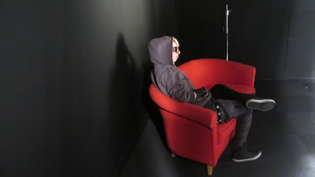
Here we used the light and the dark, to make the focal point stand out more. The focal point here is showing that the person on the chair, is some sort of authority figure. I could use this method for the sun and the moon in painting, basically make them stand out more than the rest of the painting.
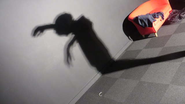
This photo uses extreme shadow, basically making the shadow look more intimidating and large, to give a feeling of dread to the person looking at the picture. This technique was used in Nosferatu,which is one of the most famous German Expressionism films ever made. I could use this method to project the shadow of the moon in my painting.
Here we used reflective surfaces, to make the picture more abstract and interesting to look at. This picture sort of makes you feel sorry for the person who was in that situation, they could be feeling scared or they're just incredibly uncomfortable with having their picture taken. I could use the light of the sun to reflect the bubble on the mountain fortress.
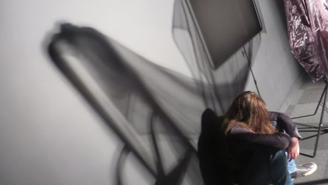
Here we used a back light in order to make the picture more dynamic, as you can see the shot here gives off a mysterious and important vibe. This relates to German Expressionism because it uses strong silhouette, also Tim Burton uses this technique a lot an he is highly inspired by German Expressionism. I could use this to do the silhouettes of the two wizards in my painting.

Attempting to use the methods in my concept piece, I think I need to expand the light to dark ratio more. I coloured the window in red because I think it actually fit into the mood of the picture.
I used the rubber to sharpen up the edges of the mountain fortress, to make it look less organic and more like actual stone. The windows are now more defined and It actually feels like you can look out of them. I like the way this is going so far, there's still a lot I need to do but I'm sort of proud of it.
I added some lighting to the sun side of the mountain fortress, the bits of stone that are closest to the sun have highlights. I made the moon a lighter shade, because the moon always gives off a glow effect.
I added the buildings and finished off the giant troll, I decided to make the buildings red because I think the grey scale colouring and the red mix together really well; I also added a ground, I still need to texture it but it makes the painting look a lot better. I'm almost done with this painting I just need to add some final touches and it should be done.
My picture is a mixture of grey-scale and different shades of red, I did this mixture of colours because they go together surprisingly well it really makes the picture pop out. I used the colours to give off a sense of danger in the picture, the sun and the moon are crashing down to earth and the red force field is the only defence between space and the earth; The rest of humanity was wiped while they were plummeting towards the surface and this is the last city left on the earth. The grey-scale shows that this is a very serious situation and the red shows the amount of tension and stress that this situation would cause. I think this painting is good, one of the few things I've done that I'm actually proud of. It nice to look at the colours work really well together and I'm really proud of the moon I painted, especially the teeth I think there're really cool. I'm not really proud of my work that often, but this is one I genuinely like.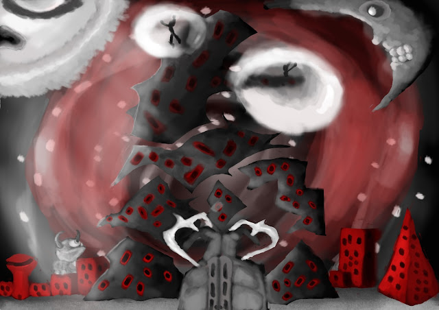
Compositional Rules in my Concept Art Final Piece
Here I have highlighted all the different forms in my final piece, to show that I understand the compositional rules.
Orange= Dominant Form
Yellow= Sub-Dominant Form
Blue= Focal Point
Green= Subordinate Form
I have put the golden spiral and the rule of thirds on my picture, this is to see if I instinctively followed one or both of these painting rules. The rule of thirds fit the painting perfectly, but the golden spiral doesn't quite fit in to the painting however the center of the spiral is nearest the gate so I guess I was right about the gate being the focal point.
German Expressionist Character- 17th November 2016
This is a stretch challenge to make a German expressionist character, I need to use all the skills I have to make a character the German expressionist style. Character in German expressionist films and painting, are usually seen as quite sinister and dark so I will need to think about this while making my character.
First I made the basic structure of the human body and skull, I distorted them a bit so they looked more expressionistic.
CityScape Concept Art- 5th October 2016
We took the cityscape we made and started to develop it digitally into photoshop, To do this we used the the rule of third, the golden spiral and horizon line; We chose between doing a one point, two point or three point perspective. The golden spiral's mathematical name is the Fibbonachi sequence.
This is what I've done so far...
I think this one is a massive improvement over the sketch, however their are still plenty of things I don't like: the messy lines, the detail on the rocky platform and it's still very bland, but I'll keep going at it and see how it turns; The horizon line of the sketch is further up therefore your looking down on the picture, I used this perspective because I wanted to give a view of all the carnage and chaos that was going on in the picture.
I developed my sketch more and changed he perspective of the tree; I added the other set of windows and put the sign on Drumpf tower, I also added a building behind the tower; The bees are much bigger than they were in the original picture. I think I like this slightly better now, granted it's not brilliant and there are plenty of things I could improve on, but this will work as a base for the painting.
This is me starting to paint my cityscape and trying to follow the golden spiral; I don't know whether it's a bit to tacky, but considering the subject matter it's not too far fetched.
I've painted into it more and I have got say that for me personally it doesn't look to bad, maybe when it's done it will look halfway decent. To do the lava I watched a tutorial from Shiam on the google drive and to do the sky I simply changed the settings of the brush and to do the clouds I went from dark to light.
I mostly painted this picture with the dark to light painting method, that a method where you start off with the darker shade and work in the highlights afterwards. I utilised both the golden spiral and the rule of third in this painting, The golden spiral's line leads to the focal point which is the giant hornet, that's hovering over the giant tree trunk shelter; The dominant form is the Drumpf building in the fore ground, the sub-dominant forms are the: is the building behind the Drumpf and the giant tree stump building in the background; the giant hornet is the focal point. I think this painting came out better then I thought it would, I could almost say I'm proud of it, although I could have added the little details you find on a tree or a stone floor, but I didn't have time to put them in because is was an experiment. I think when I'm doing my final piece for this project I should learn more about putting in the little details; I also think that although this is better than some of my previous paintings, I still thing my painting techniques need a lot of refining to get right especially on creatures and humans. The lava and the sky are done in really saturated colours so you end up seeing them first and the landing by the lava is very muted so you are mostly likely going to see it last; The bee is the focal point of the piece so I was going to colour him with a really bright yellow so he would stand out, but I didn't have time.
The red highlight is the dominant form
The yellow highlights are the sub dominant forms.
The blue highlight is the focal point
Colour Theory- 11th October 2016

Highly contrasted colours tend to attract more people to a painting, this is because humans find some meaning in colour in a picture; In fact their are some colours that attract more people than others like red, green, black, etc.. using these types of colours in moderation can really boost the amount of people interested in your work.
Colour Wheel
This Colour Wheel is going to be a reference point for when I do a painting, this is going to help me understand the different colour types, what the complimentary are, what saturation's I would use in a monochromatic painting, etc..
How I Painted The City Scape
The first thing I did when I started to paint was the building, however it was taking way too much time so in the end I decided to start painting the lava; Shiam helped me with this by showing me a video of her doing it, she used the dark to light method and found that this method was a lot easier for me, I could paint much faster and get more detail at the same time. The dark to light method is very self-explanatory, you start from the darkest colour and finish with the lightest colour, this method has been used for a long time, even the old masters used it to make their paintings, A prime example of this is the Mona Lisa by Leonardo Da Vinci:

Evaluation of City Scape Project- 12th October
In this mini-project we made a cityscape on photoshop, out of the observational drawing we made of the city we made out of random objects. The point of this mini-project was to improve our observational drawing skills, our painting skills and our ability to make something off the top of our heads. This will eventually help us with our concept art final piece because we had a limited time frame to make it and this will help us to manage time better in the future,we also had to use the rule of thirds and the golden spiral this will help with different perspectives, this will enable us to make more dynamic and interesting paintings in the future and finally we had to paint it this will obviously improve our painting skill and that will translate into our German Expressionism painting (which is the final piece of this project), it will also help with other paintings we will have to do in the future.German Expressionism Films- 14th October 2016
German Expressionism an art form that was done in Germany, from the year's of 1910 to 1930; This art came in the form of movies and paintings, they would have very over the top backgrounds and highly contrasted colours, the paintings and films of the time were usually very focused on the frightening and depressing things that were going at the time.
What Ever Happened To Baby Jane (1962)
What Ever Happened To Baby Jane is more Film Noir than German expressionism although it is heavily inspired by it; for example the very dark nature of the movie it doesn't make everything seem wonderful,it very much pushes the point forward that Jane is delusional and everything will not turn out well in the end for her; also the film has very highly contrasted lighting and in some of the scenes the backgrounds can be very surreal.
In Memoriam of Karl Liebknect (1920)

This is definitely an example of German Expressionism: It was made after 1910 and before 1930, it's a painting done in monochrome (one colour in different saturation's), the colours are very highly contrasted and the line are all over the place; the subject matter involves a death of a guy who was killed during the conflict of the first world war and it's shows that this is a very sad piece of art.
Paul Leni: Waxworks (1924)

This is another example of German Expression, the reason for this is because all the entryways and windows are all contorted and surreal instead of just being plain squares or rectangles, also the lighting is all very highly contrasted and monochromatic, the lines in the scene are all twisted and have no order to them. This movie contains several different stories and their all about people being put to death or murder.
Dr Jekyll and Mr Hyde (1931)
This Movie isn't German Expressionism, it's very inspired by it but I think it leans more onto being plain film noir, It does have the high contrast and monochromatic colour, but it doesn't have the weird surreal backgrounds and it's a very tame film it has a happy ending; Dr,Jeklyll is seen as the as the noble hero being taken over by his dark side, which he eventually overcomes in the end; This movie also wasn't made between 1910 and 1930, which is when all the true German Expressionism was being made.
Jakob Stienhardt (1913)

This painting is most definitely German Expressionism, It was made a year before the First World War happened but you can clearly see the city is very militarised and the people in the houses look very frightened. All the ascetic aspects of German Expressionism are there too like the highly contrasted colour, the different types of crazy line and just how overall dark the subject matter is.
A Game Based Off Nosferatu- 19th October 2016
Nosferatu is a Silent German expressionist film made in 1922, it's based off the events of Bram Stokers Dracula (the book version).
Nosferatu is not entirely black and white, in fact a lot of the scenes in the film are actually done in a monochromatic colour scheme, I should really think about this when making a game based of this movie.

Unnamed Game
After the death of Count Orlok in 1854, their have been many vampires that have wanted to claim the title as the ruler of the underworld but none have succeeded. Ruler of the Underworld is not just a title that's exclusive to vampire's the current ruler is a stone golem nicknamed stoner, it's a name to purposely mock him however no one has managed to defeat him yet every vampire that has tried has either come back badly beaten or so mashed that they could be brought back in a coffee cup. Here we come to our "hero" of the story Tome (this character's appearance and gender can be changed) Tome is an office worker, who wants some excitement; while walking down a spooky alleyway our hero comes across an old man
Half Term: German Expressionism Marathon- 22nd October 2016
M (1931)

Directed by: Fritz Lang
This is a movie about a murderer who goes around killing different children, however the movie only shows a child named Elsie getting groomed and eventually killed by the murderer. This murder is the last straw for the people and they go on a man hunt for the person that did it, that lasts for the majority of the movie. This movie for me was a lot more enjoyable than Nosferatu, it didn't spend that long on a specific scene. Long enough to clue us in about what's going on, but not so long that it makes you want think why isn't this scene over already . Here are some of the scenes from the movie that represent German Expressionism.
Whatever Happened To Baby Jane (1962)
Directed By Robert Aldrich
Whatever happened to Baby Jane is about a child star called Baby Jane, who is now an adult who's still believes she can revive her career which is long since over. Her sister got disabled in an "accident" is being taken care of by Jane. As the movie goes on Jane slowly gets more and more unhinged and her sister gets more terrified as the movie goes on. I really enjoyed this movie, I like how dark it is and how it never seemed to hold back on these moments, their was none of the usual sentimental dribble that tends to be in a lot of movies; What I mean by that is an overly emotional movie that's only purpose is to emotionally manipulate people into giving their money.These are some of the examples of German Expressionism in the movie.
Vertigo (1958)

Directed By Alfred Hitchcock
Vertigo is about a guy named Scotty who oddly enough has vertigo, he falls in love with this women who the husband thinks is possessed and later on she commits suicide, then Scotty meets another women who looks exactly like his friends wife who is played by the same actress. I found this movie to be very dull not much went on until the half way point and even then I didn't find myself involved in the plot. I watched this movie because Alfred Hitchcock was heavily inspired by German Expressionism while making it, you can clearly see this with some of the shots taken from the film.
Spellbound 1945

Directed By Alfred Hitchcock
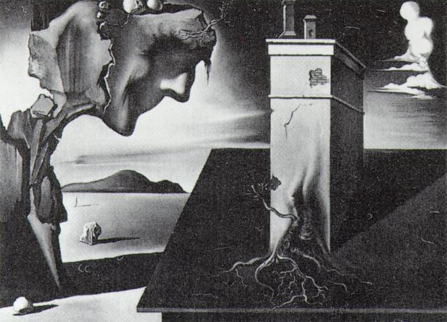
Spellbound is about a psychiatrist who's trying to protect a man, who believes he's murdered someone and she spends the majority of the movie trying to prove that he's not guilty, it's a sort of a mystery/romance movie. In my opinion this movie was incredibly dull and uninteresting, the only German expressionist bit in the movie was the dream sequence which was illustrated by Salvador Dali; Here are the bits that are the most expressionistic.
Psycho (1960)
.jpg)
Directed By Alfred Hitchcock
Psycho is about a women who stole some money from this rich guy, so she runs and stops at Bates Motel. Norman Bates greets her and gives her a room, later on Norman ends up killing this women; from that point on the rest of the movie is set around her murder. It's not just a classic it's also a spectacular movie, Norman Bates is a really interesting character to follow and so are Marion Crane and Lila Crane
the one who gets killed and her sister. I feel like this is a massive cut above most of the films I've watched (apart from What ever happened to Baby Jane that movie is just a good as this one). There are quite a few scenes in Psycho that are heavily inspired by German expressionism.

Metropolis (1927)


German Expressionist Piece (Experimental Stage)- 2nd November 2016
Moodboard
German Expressionism Experiments
These are some quick sketches. For these sketches I used the polygonal tool, the fill tool and the transform tool. These are just experiments to give us an idea of what we wanted to do, in our actual final piece.
These are the five German expressionism experiments I made. I'm quite disappointed with the first three on the left, I think the colours are way too dull and there's just not that much life or energy in them. I actually kind of like the last two I did, the colours aren't too gordy, and the monochrome colours I used were just right.
Red is the dominant form.
The yellow is the sub-dominant forms.
Here I'm spotting the dominant and sub-dominant forms I put in my work. I also needed to see if the picture I did fit into the rule of third and the golden spiral, this was to see if I naturally follow these rules. I think a few of them follow the rule of thirds and the golden spiral, but most of them only seem to follow the rule of thirds.
Developing My Experiments- 8th November 2016
The Two Experiments I Will Develop
I chose to develop this experiment because, I can see it becoming a pretty cool environment if I work in to it. I see it becoming some kind of mountain fortress or maybe a tower.
This sketch came out a lot better than I thought it would, I'm almost proud of it the sketching is nicely done and there's quite a lot going on. However I think that a little more detail could have gone into the city below and I think I could have added, a few more creature into it.
I like the design of this one , I think if I work in to it a bit more it could become something really cool. It look like a helmet from a soldier who was killed in battle, I could probably do something around that sort of concept.
To be honest I'm not very impressed with this sketch I think it could have put a little more work into it. I think if I paint it then it will be better, but a really I want to spend time developing the first sketch I did, because that one is much more interesting and impressive.
Concept Art Final Piece- 9th November 2016
This is the sketch I chose for my final piece, I think this sketch is really cool and their are so many things I could do with it.
I decided to paint it in black and white, I was going to paint it in full colour but I found that it was much better looking in a grey-scale format.
Research on Chiarscuro Artist's
Leonardo Da Vinci

The face of the angel is the primary highlight of the painting, Leonardo obviously wants the viewer to focus on her face. The wings a slightly saturated in darkness and there's a guy standing over her, who blends into the background of the picture.
Playing House (2013); Unknown Author
One side of the guy's face and his torso are shrouded in light, the other half of his face is completely engulfed in shadow. The hallway next to him is pitch black and it looks like this guy is the focal point of the photo. This picture has a very mysterious feel to it, and sort of makes you think what is he doing with that bleach.
Rembrandt von Rijn

The left side of the knights face is highlighted and the other side is shrouded in shadow. The guy in the picture looks like some sort of general, the background is pitch black and he's obviously the main focus. He looks like he might be preparing a battle strategy or maybe one of his comrades fell in battle because he looks really upset.
Examples Of Chiaroscuro Lighting In German Expressionism
Chiaroscuro lighting
This kind of lighting is used a lot in German expressionism. Chiaroscuro lighting uses extreme light and dark, in order to dull or enhance a particular scenario. It's used mostly in black and white films but there are some colour films that use this type of lighting. This is research that will assist be while working on my final piece.
Chiaroscuro uses extreme light and dark, to create atmosphere. This scene is from the movie Metropolis (1927), and as you can see the heavily contrasted lighting, makes the scene really pop out.

The light and dark can make a very powerful focal point. Here you can see that all the heavy shading round this scene, really makes his face stand out and shows you that his face is definitely the focal point. This scene is from The Cabinet of Dr. Caligari (1921).
The use extreme shadows to create suspense. This is one of the most common elements of all German expressionism films, they would use this in order to bring the point across that someone was intimidating or very predatory. This Scene is from M (1931).

It sometimes uses reflective surfaces such as windows and glass, they do this to make the scene more abstract. Take this other scene from M the reflection of the object in the window are framing his face.
It also uses streams of light, to exaggerate the depth and abstractness of the scene.

Chiaroscuro Experiments In Dark Room
After researching chiaroscuro lighting, we did some experiments using by taking photographs of our selves in chiaroscuro style. These are the pictures we took. These were experiments before I did my final piece.
Here we used the light and the dark, to make the focal point stand out more. The focal point here is showing that the person on the chair, is some sort of authority figure. I could use this method for the sun and the moon in painting, basically make them stand out more than the rest of the painting.

This photo uses extreme shadow, basically making the shadow look more intimidating and large, to give a feeling of dread to the person looking at the picture. This technique was used in Nosferatu,which is one of the most famous German Expressionism films ever made. I could use this method to project the shadow of the moon in my painting.

Here we used reflective surfaces, to make the picture more abstract and interesting to look at. This picture sort of makes you feel sorry for the person who was in that situation, they could be feeling scared or they're just incredibly uncomfortable with having their picture taken. I could use the light of the sun to reflect the bubble on the mountain fortress.

Here we used a back light in order to make the picture more dynamic, as you can see the shot here gives off a mysterious and important vibe. This relates to German Expressionism because it uses strong silhouette, also Tim Burton uses this technique a lot an he is highly inspired by German Expressionism. I could use this to do the silhouettes of the two wizards in my painting.

Attempting to use the methods in my concept piece, I think I need to expand the light to dark ratio more. I coloured the window in red because I think it actually fit into the mood of the picture.
I used the rubber to sharpen up the edges of the mountain fortress, to make it look less organic and more like actual stone. The windows are now more defined and It actually feels like you can look out of them. I like the way this is going so far, there's still a lot I need to do but I'm sort of proud of it.
I added some lighting to the sun side of the mountain fortress, the bits of stone that are closest to the sun have highlights. I made the moon a lighter shade, because the moon always gives off a glow effect.
I added the the ogre that's terrorising a town down below, I will add the town after I finish the ogre.
I added the buildings and finished off the giant troll, I decided to make the buildings red because I think the grey scale colouring and the red mix together really well; I also added a ground, I still need to texture it but it makes the painting look a lot better. I'm almost done with this painting I just need to add some final touches and it should be done.
My picture is a mixture of grey-scale and different shades of red, I did this mixture of colours because they go together surprisingly well it really makes the picture pop out. I used the colours to give off a sense of danger in the picture, the sun and the moon are crashing down to earth and the red force field is the only defence between space and the earth; The rest of humanity was wiped while they were plummeting towards the surface and this is the last city left on the earth. The grey-scale shows that this is a very serious situation and the red shows the amount of tension and stress that this situation would cause. I think this painting is good, one of the few things I've done that I'm actually proud of. It nice to look at the colours work really well together and I'm really proud of the moon I painted, especially the teeth I think there're really cool. I'm not really proud of my work that often, but this is one I genuinely like.

Compositional Rules in my Concept Art Final Piece
Here I have highlighted all the different forms in my final piece, to show that I understand the compositional rules.
Orange= Dominant Form
Yellow= Sub-Dominant Form
Blue= Focal Point
Green= Subordinate Form
I have put the golden spiral and the rule of thirds on my picture, this is to see if I instinctively followed one or both of these painting rules. The rule of thirds fit the painting perfectly, but the golden spiral doesn't quite fit in to the painting however the center of the spiral is nearest the gate so I guess I was right about the gate being the focal point.
German Expressionist Character- 17th November 2016
This is a stretch challenge to make a German expressionist character, I need to use all the skills I have to make a character the German expressionist style. Character in German expressionist films and painting, are usually seen as quite sinister and dark so I will need to think about this while making my character.
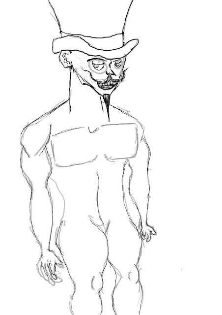
First I made the basic structure of the human body and skull, I distorted them a bit so they looked more expressionistic.
I cleaned up the lines and added some facial features like a moustache, a top hat, a nose and a mouth. I also gave the hands more movement and detail.
Here I defined the facial features a lot more. I added all the little details within the ears, I also added the eyes and the eyebrows.

Concept Art Project Evaluation- 17th November 2016
To come up with my German expressionist environment, I looked at different German and post-German expressionism paintings and movies: However we stuck to watching German expressionist movie like Nosferatu, Metropolis, Cabinet of Dr. Caligari and M. We also made a mood-board out of all the different German expressionist painting and scenes from films we liked. Though the deciding factor was when we made environments using the polygonal and fill bucket tool, we had to do five sketches, choose two to develop and one out of those two to be the final piece.
I really like the different lights and shadows within German expressionism, it makes any picture or scene that would usually be really bland and uninteresting into something really interesting e.g. Say you have a painting of two people talking normally a painting like this would be quite dull, however once you had all the dynamic shadow and lighting that image suddenly become a lot more interesting with exaggerated shadows and the rim lighting; they could be talking about puppies and it would still appear very serious and intense.
I used to colour in my work to show the seriousness and peril of the situation that's going on in my painting. The colours I used were red and grey, these two colours compliment each other very well, I was going to go purely grey-scale, however I looked at the windows I painted in red and thought that these colours naturally go with each other I should sort of mix it in with the grey-scale, and to my surprise it worked very well. The grey and the red give off a very intense effect of danger and damnation, it really makes you think that there's no hope for the people in the picture well there isn't anyway considering the soon and moon are barely being help back by a single magic force field.
I used light to show the intensity of the sun. My light sources where the sun and the moon, the sun was obviously the strongest light source, however the moon give off the slightest bit of light; Also I forgot to mention that the wizard that are casting the force field, are emitting light and so is the larger force field that's blocking the sun and the moon.
I didn't really use any properly defined perspective in the painting, in German expressionism all the perspective is really skewed so I could get away with not using heavy perspectives. I think it made my work look more authentically German expressionist.
My work fits the rule of the thirds perfectly, no action is going down in the first row but as you go further up you see more action taking place; The sun and the moon crashing down to earth is only seen on the top column. The Fibbonachi sequence doesn't quite fit the painting, the middle of the spiral almost hits the gate that's why I labelled the gate as the focal point. It helps my work look more pleasing to the eye, since people tend to like order in things they can find very off putting if some thing doesn't have any composition.
I think my main inspiration for my painting, was all the German and post-German expressionism movies I watched e.g Psycho, What ever happened to Baby Jane and M. Well I was inspired by the different types of imagery found in the films, and the many interesting scenes that were in the movie that showed off heavy inspiration from German expressionism or were German expressionism. Although none of theme directly inspired me to make the concept piece, I was still inspired by all the different lighting and you could find in these movie as well as the dark stories found in them which is sort of an inspiration for the setting in my environment.
The secondary sources I used were movies and paintings from the era of German expressionism, and people who were inspired by it like Alfred Hitchcock. They helped me to understand the different shading and perspective that goes in to German expressionism, this really helped me to understand what my final piece should look like; without these sources I actually don't think I could have achieved the final design I came up with.
For primary sources we went into a dark room and took pictures of ourselves in expressionistic position. The photos we took didn't really help that much to be honest, most of the stuff I did in my final piece was because of all the films and paintings I looked at that really helped me to get a grip on German expressionism.
The research that helped me most of all during this project, was definitely the secondary sources I researched all the films and painting from the era of German expressionism and post German expressionism.
Firstly we had to use the rule of thirds and the golden spiral and make some photoshop sketches, we then had to paint them .We made are own city out of different objects and drew the outline of it, after we had done that we sketched within the outlines and made our own cityscape; We then had to put it on photoshop and develop it further by adding the rule of thirds, the golden spiral, improving the base sketch and finally painting it. Then we started to experiment with the polygonal and fill tool, in order to make some quick experiments before we went on to the final piece. We then picked two of these to make developed sketches of, Finally we had to pick one of the two sketches we wanted to be our final piece.
The photoshop sketches really helped me to improve my work with perspective and proportion, also I feel that my painting skills have improved since I did those experimental sketches/paintings. Making the cityscape helped me to better understand how to make an environment, that means all the different colours and angles that make a dynamic and interesting landscape/cityscape; I would also like to add that after this mini-project, my painting skills improved quite a bit. The quick German expressionism experiments really helped me to get a better grasp on the style of Geman expressionism, at first I was making the colours to bright and intrusive I found that in German expressionism you really shouldn't be using that many different colours.
If I were to change anything I would improve on the silhouettes of the wizards making the force field, give the sun's face more personality instead of making it look life less and depressed and finally I would spend more time on time on the shading, this would allow me to make the shading much more highly contrasted and expressionistic.
If I was given more time to develop this project further, I would probably make it in to a video game. The concept piece I did could be the set up for the game's opening act, the sun and moon come crashing down to earth but two wizards stop them from colliding with Earth; 100 years later everything is being rebuilt however the force field stopping the sun and moon is wearing off and the main character needs to power up the force field again before the Earth is destroyed. The sun and moon crashing down to Earth could be a cut scene, that show the two wizards making the force field and stopping the sun and moon from crashing down to earth. I could also make it in to a animated short, were you see the two wizards trying to stop the sun and moon but they're too hard to hold back and in the end their spell fails and the Earth is obliterated.




No comments:
Post a Comment